The New and Approved 27 Cranberry – Still Too Big?

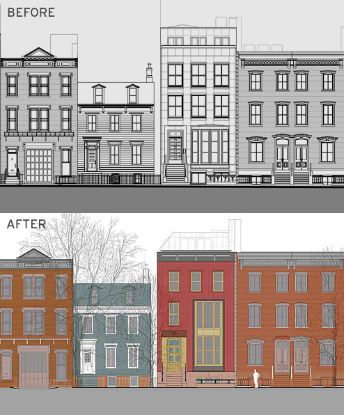
While the new design for 27 Cranberry Street by local starchitect Tom van den Bout has LPC approval, it still has some preservation minded Brooklynites wringing their hands. The new design substitutes brick for brownstone and zinc for bronze elements but some think the home is still too big for its humble block.

However, this process and discussion around this project is a perfect real-time example of the search for “authenticity” outlined in Suleiman Osman’s The Invention of Brownstone Brooklyn.

If both plans were equal in scale, how “authentic” is the new approved brick facade versus van den Bout’s original vison of real brownstone (from the original quarry) frontage? It’s equally plausible that “back in the day” a builder may have chosen to build a brownstone on that lot.

What do you think? If the argument is based on scale, is “historical” relevance no longer in play? Are we now in the business of arguing over which imaginary “past” we’d like to embrace in future construction?

Brooklyn Paper: “We wished he would build a small house instead of what he’s entitled to build — but it’s still impressive,” said Judy Stanton, executive director of the Brooklyn Heights Association, which unsurprisingly supported van den Bout’s original plans. He is a former president of the association, after all.

Simeon Bankoff of the Historic Districts Council, who opposed the townhouse from the start, said he’s resigned to the new plans.

“It’s too big,” Bankoff said. “Cranberry Street is specifically low scale so it’s a tough site. This might have worked if it was on another block in Brooklyn Heights.”

Share this Story:

,

  • harumph

    I think the first plan was much better – don’t really understand the large double tiered “parlor” window – yuck!

  • nabeguy

    Agree about the atrium window…straight out of Hovnanian-ville. I guess it’s to compensate for the loss of overall window scale between the two designs. The ones in the first design were not in contextual scale to the surrounding houses, as they are in the new plan. And I think brick was the way to go

  • Gerry

    This looks like a McMansion that belongs in New Jersey.

  • http://www.youtube.com/watch?v=UlsiLOnWCoI Arch Stanton

    Agreed, the window is seriously ugly, a piece of architectural desperation.

  • Curmudgeon

    Original design was much better. That window is just too big, not at all fitting on that quaint block..

  • David on Middagh

    No architectural deed goes unpunished. If/when construction begins on the hotel at Pier 1, 27 Cranberry may wish they’d left the windows off.

  • bornhere

    I do think it’s something of an improvement; but now it’s sort of like Ocean Parkway’s Late and Great La Mer meets Brooklyn Heights.

  • EHinBH

    Get over it, people. You should of left well enough alone…

  • stuart

    the first design was better.
    real brownstone would have been far more interesting than brick.
    do the commissioners drink at these meetings?

  • my2cents

    Yet another well-intentioned design ruined by the meddling of the aesthetic thought police…The original was much better proportioned and more distinctive. I never had a problem with it other than it was a tad tall. And frankly, can someone tell me what is more “historically correct” about this? the brick??

  • Karl Junkersfeld

    Wonder if Judy Stanton would like the design and size if it was being constructed on Garden Place and by Walentas. No question the BHA would be calling their high priced lawyers to intervene.

    One note, I love the fact that nabeguy is still hanging around the blog. Love you buddy.

  • Muskrat

    Agree w the remarks re the double-trouble big front window. It has the look of a 30s “moderne” treatment but without the forgivability (as in, don’t we know better by now?).

  • nabeguy

    Karl, my body may be out here, but my heart remains in the Heights

  • Big Dave

    Windows offer light,
    A season’s art of nature,
    But this one’s ugly…

  • Cranberry Beret

    f you don’t like the second design, blame the architect and his client.  No one at Landmarks made him do this.  They said make it smaller and don’t use brownstone – but he came up with this dreck on his own.

    Not sure why anyone would promote the architect’s choice of brownstone in the first design.  The original post says “It’s equally plausible that ‘back in the day’ a builder may have chosen to build a brownstone on that lot.”  Just not true.  Look at all of the other houses on the block and surrounding blocks.  All brick or wood houses.  This lot had a wood house for 100 years, and has been empty for 80.  Picking brownstone, and all the hoopla about being “real” brownstone, was just an ego exercise for the architect. Brownstone is the “imaginary past” for this lot.

    I suppose you could blame Landmarks for allowing the front window in the second design.

  • harumph

    “I suppose you could blame Landmarks for allowing the front window in the second design.”

    @cranberry beret: you suppose right!

  • calm down

    i say we welcome our new neighbor…if we want to talk about taste, then read your comments, most are tasteless…let a guy have a home. it’s awful, this has become a tabloid.

  • nabeguy

    Sorry ,but we will not calm down. “Let a guy have a home:” What if the residents had let Moses have a highway? The architectural integrity of the Heights must be maintained…period.

  • harumph

    @calmdown I don’t think any of the comments above are tasteless – which on a blog is a rather remarkable thing.

  • dog lover

    The original design was better. As a Garden Place owner, I think it would look fine on our block. You have to understand that we have lots of different styles and sizes, from narrow and tall to wide and tall, to great carriage houses (neither originals) to narrow and not so tall, from the mid 1800’s to some that slip in when no one was paying attention.

  • my2cents

    Nabeguy,
    You can’t invoke Robert Moses over this topic. That is ridiculous hyperbole.