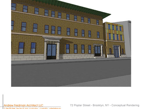
Renderings of the New 72 Poplar

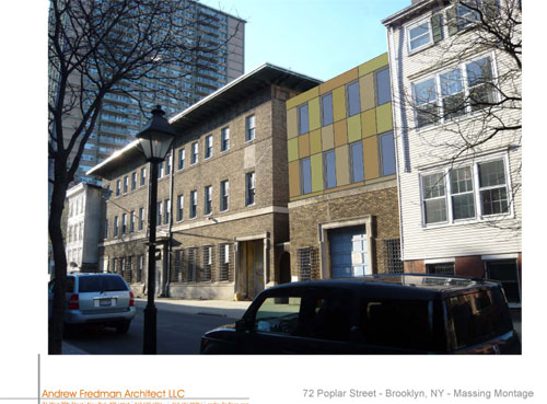
72-poplar-massing-montage

Regal Investments, the developers behind 72 Poplar Street, have provided us with renderings from architect Andrew Friedman of their new plan for  a  “luxury market-rate rental” property there.

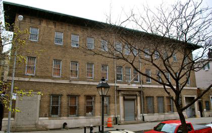
72 Poplar as it stands today

72 Poplar as it stands today

72-poplar-conceptual-rende

As we reported from this week’s CB2 meeting:

There are plans to reconfigure 72 Poplar St., the former 84th Precinct station house, into 24 luxury, market-rate rental apartments.

The developer — Regal Investments — has revised its 2007 plan and the building’s reconstruction now includes a 2-story addition to both the garage and main building, which will be comprised of a precast concrete hanging wall. The garage will be converted into a four-story, 35’ one- or two-family home, explained architect Andrew Fredman, and the addition to the original building will not be visible from the street because of its sight lines. Ground floor space will be for medical offices, and the developer is completely restoring the original iron window gates, brickwork, and framing along the building’s façade.
Share this Story:

, ,

  • ABC

    ouch.

    if ever a glass box addition was called for, this is it.

    funny, the scale of the main building looks all wrong. the windows look ‘right’ in real life, and in the renderings they look all wrong

  • yo

    usually the rendering looks “better” than the actual picture…ugh

  • In the Heights

    I do hope the developer looks at the design of the new PS8 addition (that will be in the open lot one building down) to make his project work on the block. There is going to be a lot of construction on that block. Between this and the addition to PS8 that is slated to start in July, it is going to be a total mess.

    Poor Judy the swimming teacher at Eastern Athletic. Doesn’t she live in the house that is be between these two projects?

  • nabeguy

    A little roofline overhang on the garage addition might help it maintain a contextual continuity and make it look less like it dropped out of the sky.

  • Carol

    This Precinct House (former holding cells and offices) manages to have so much more architectural dignity and presence than most of the so-called luxury developments on the market today.

  • bornhere

    Once again, an “improved” design lacks texture, while introducing some Ikea-gone-morose colors. And if the architect doesn’t think that wrought iron security gates would be affixed to the first-floor windows faster than they can trash the current bars, delusion is at work. I also agree with nabe (whose
    “name” is just fine, I think), that something atop that extension wouldn’t hurt. But that Mondrian-airport-health-clinic look is pretty awful.

  • my2cents

    I know I am the resident champion of “moderism” here on the BHB, but I think that cube is not workin.’ Looks somehow incomplete. I also sort of want them to keep the bars on the lower windows. :-)
    That said, I am glad to see this totally creepy building be transformed into a usable living place.

  • Hick Street

    Holy cow that’s u-g-a-l-y. I live around the corner and have been waiting for years for someone to announce a conversion plan. In my heart I always knew that when I finally did see said plan I’d wish they’d just leave the old building alone. That day has come. Renderings look like the architect spent about 5 minutes scrawling them on a napkin between martoonis. An insult to both the nabe and the precinct house. Add one more proof to my contention that about 95 out of 100 architects and developers are soul-dead tools.

  • AEB

    Bad rendering of a too generic design.

    I’m always astounded when presumably talented people put their heads together and come up with something as woefully anonymous as this.

    Perhaps that’s the meaning of “design by committee.”

  • nabeguy

    Am I missing something here? Is the wide building in the picture not the main building, or is there another one behind it? I’m not Archimedes or anything, but what specific site lines is the architect referring to when he claims that the 2 story addition to the main building won’t be visible from the street? Like standing next to the building and looking straight up? Without setting it back quite a ways (and based upon the middle picture above, the building doesn’t appear that deep) I can’t imagine how this addition wouldn’t be visible, and certainly would be from the vantage point that these renderings are done from. Are we expected to utilize our mental Photoshop tool when walking by the place?

  • dan

    Looks like the architect spent all of 5 minutes on that design.

  • jiker

    it will stay as it is for many more years.

  • verité

    Bornhere–Please note that in the notes from the CB2 meeting the developer said that they would restore the iron gates on the windows.

  • bornhere

    Thanks, verité — but that bit of good news makes the renderings even weirder: why not provide more accurate sketches?? And as nabeguy pointed out, the (horrible) addition sure seems visible from a street view. This is like a reversed “suggested serving” of something like frozen fried clams, in which the illustration usually looks all Lundy’s and the reality is Red-Lobster reject. Surely one of the strangest approaches I’ve seen.

  • nabeguy

    bornhere, I took another look at the building, and there is, in fact, a back building that’s attached to the one that fronts Poplar. I presume that’s where they propose to tack on the additional floors. Based on what they’re proposing for the garage, I certainly hope that the addition won’t be visible. I get that the color and grid pattern is supposed to emulate brick-and-mortar, but it’s not working for me. More like b & m on steroids. A tighter grid would have worked better with the restored window gates.

  • http://www.robertaharrisarchitect.com Bob Harris

    The existing station house has a modicum of charm that it owes to the mottled brick coloring in combination with its white windows and white muntins. If such things were acknowledged as desireable and retained… or, in the case of the windows, replicated, then a certain comfort factor will be acheived. It could just be that the rendering doesn’t communicate these desires.

    Keeping the security grilles on the first level windows would be an opportunity for more decorative comfort and peace of mind.

  • sketchup and mustard

    Precisely what can happen when sketchup ends up in the wrong hands and images release without a PR filter. Looks like they spent all their time modeling the building nextdoor.