Updated Rendering of Sleepy’s Montague Reno

2062-a200-exterior-elevatio

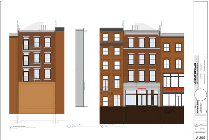
After BHB reported on the planned expansion of 116 Montague Street, currently home to Sleepy’s,   images from the owner’s original-LPC-rejected plans surfaced in online reports.

BHB has obtained the updated, LPC approved  elevations from John S. Newman, of Lindsay Newman Arch & Design .

New, better, improved? What do you think? [Larger image via PDF here]
Share this Story:

, , ,

  • Nancy

    Will it really be made of milk chocolate?

  • Andrew Porter

    The original design was horrible, a really glaring piece of crap. The only thing going for it was the thought of getting it done in a weekend. At least it didn’t include vinyl siding. The new design is ever so much better, and may show that the LC may have learned a lesson after the infill construction just north of Atlantic Avenue on — is it Hicks Street?

  • bornhere

    I think the “new” design is infinitely better than the first and much better than the current configuration. Of course, a continuing Sleepy’s presence doesn’t help a whole lot….

  • my2cents

    I totally disagree folks. This is another example of modernism being crushed under the wheels of the aesthetic “thought police.” The original design was not a gem, but i think it would have been perfectly acceptable had it been built. That sleepy’s structure is in no way “historic” so i see no reason why we should have to erect a phony “antique’ building on top of it. Think, people: would this behavior make any sense in any other part of life? Should we drive hybrids that look like Model Ts? Should we all have steampunk computers with brass typewriter keys? It’s 2009…get over it! I am all for preserving historic architecture, but not for making new architecture that is an ersatz replica of it. If you guys take a stroll around cobble hill you can see some examples of really nice new modern buildings blending respectfully next to traditional structures. I wish we could have that more enlightened view here in the heights.

  • Andrew Porter

    The argument isn’t over whether or not Sleepy’s is a historic structure. Clearly, it’s not. But the entire district is the overall concern. By your logic, my2cents, you could erect a 20-story sliver because that location isn’t historic. The concern was clearly how the first design related to the rest of the buildings in the district, on Montague, on that block. And in context, the first design sucked, to use an architectural word.

    BTW, my water-powered computer with its brass keys works fine, though it’s a big job to keep the keys polished. I’m upgrading to Windows 1895 next year…

  • my2cents

    Andrew, thanks for your reply. I only want to correct you on one thing: my “logic” in no way endorses flouting the height restrictions in the zoning rules. I would never endorse building a sliver there, and you know it. I am purely talking about aesthetics here, not scale. Modern vs. pseudo-historic has nothing to do at all with the question of scale. Just because a building is modern does not mean it can’t work with surrounding facades. Architectural diversity is important in streetscapes. i find the copying of antiquated forms to be rather stifling and bland frankly. If you want a great example of an older modern building that is very respectful of its site, I suggest you walk over and see the structure at Pineapple and columbia heights. It is a brick 70s structure and is unapologetically modern, yet the window courses line up with the neighboring rowhouses, and the brick outcroppings on the lower level repeat the rhythm of the bay windows on the neighboring buildings without slavishly copying them. It is not a beautiful building, but it is an example that modern does not equal “out of context” in every case. here is a link:
    http://maps.google.com/maps?client=firefox-a&channel=s&hl=en&q=cranberry+and+willow+11201&ie=UTF8&split=0&gl=us&ei=4fSnSab9L-PetgfN7tXXDw&ll=40.699007,-73.99601&spn=0.012413,0.027895&z=16&iwloc=addr&layer=c&cbll=40.698932,-73.996036&panoid=saPmkmapI_veu80PpL89TQ&cbp=12,144.4095579155361,,0,-3.653846153846155

  • Mies

    “It is not a beautiful building.”
    I think that pretty much sums it up as a survey of the contemporary-styled buildings in the heights since the 1960s. I think your idea is valid (and by the way, BHA and LPC agree – see the approved renderings for the building on Pineapple between Henry and Hicks) but the execution has been just as, or more, bland/mediocre than the “historicist” buildings.

  • brooklynite

    I have always wondered about that building on Pineapple and Columbia. I actually think it is awful. There are VERY few “new” buildings in cobble hill, carroll gadens, etc that I think fit in nicely with the surrounding neighborhood. Most of them stick out like a sore thumb and ruin the look of the entire block. This is what these neighborhoods in brooklyn are all about. The beautiful brownstones and prewar buildings. I like modern buildings and architecture, but sometimes they just don’t fit in.

  • Nancy

    2 cents: get a clue. modernism is not being crushed by the forces of the thought police. It is being crushed by the fact most people think it is really really ugly. Where do most ultra-modernist architects live? Usualy in the historic parts of the most beautiful historic cities. They’re no fools.

  • GHB

    my2cents, that building is a really poor example for your argument. The building is fugly, but worst of all is that brick fortress-like wall at street level. I think modern can work in a historic district, but this ain’t it!

  • bornhere

    GHB – Are you talking about the back of the building?

  • bornhere

    Never mind, GHB. I missed the allusion to Pineapple Street.

  • AEB

    What one asks–or should ask–of projects like this is that they fit into the surrounding “made” landscape without calling too much attention to themselves.

    Which an addition like this could do in a number of ways, by, for one thing, the use of cheap or bogus materials.

    This seems to strike a properly inoffensive yet reasonably characterful note. Let us not forget, also, that it must surmount a Sleepy’s, which could take the heart out of any architectural addition.

  • my2cents

    Do you guys walk around other parts of Brooklyn? There are a lot of really nicely executed modern buildings that look straight out of Dwell magazine that have been put up in Cobble Hill, Carroll Gardens and Boerum Hill within the last 5 years. But somehow people fear that here. I’ll give you a better example of a modern strip of row houses that harmonizes well with the surrounding block:
    http://maps.google.com/maps?client=firefox-a&rls=org.mozilla:en-US:official&channel=s&hl=en&q=state%20street%20and%20schermerhorn&um=1&ie=UTF-8&sa=N&tab=wl

    Once those trees mature to match those across the street, that whole development will be really really nice. And for those of you who think it is bland, please look across the street and tell that the older buildings are really that much more interesting because they have cornices over the doors.

    nancy, yes I am a modernist designer, and yes I love living in my old building :-) I don’t want any old buildings torn down and replaced unnecessarily. I believe strongly in preservation. I also believe strongly in progress and that new buildings should look new, just as those brownstones were new at one time.

  • my2cents
  • bornhere

    As I was reading your posts, I was anticipating that, once I checked the links, I would be at odds with you. We’re at odds. I know nothing about architecture, but I know what I like; I think the structures on the link are flat and devoid of texture and life. I’m sure they could have been worse, and maybe everything is relative. But they’re not my cup of limestone.

  • Homer Fink

    Posting a link? Use TinyURL for longer addresses.

  • my2cents

    bornhere, they’re better than some disney “main street” pastiche.

  • my2cents

    also, federal style brick row houses are quite austere, and would have been rather “flat and devoid of texture” when they were first built as well. But 150 years of acid rain will give anything “character”

  • GHB

    my2cents, is that whole block of State newly renovated? I agree. THAT modern building fits in beautifully with the surrounding area. But the one on Columbia Hts @ Pineapple…not so much.

  • Mies

    “also, federal style brick row houses are quite austere, and would have been rather ‘flat and devoid of texture’ when they were first built as well. But 150 years of acid rain will give anything ‘character.'”

    Not really true, since the materials like bricks back then were hand-made and irregular and had “character” built-in from the get go

    On the other hand, someone above was correct in posting that using shoddy/cheap versions of new materials can make a historicist building look pretty bad even if it slavishly copies the design of an older building

  • http://selfabsorbedboomer.blogspot.com Claude Scales

    In general, I agree with my2cents, in that I’d prefer a well-designed structure in a contemporary style at that location to one that attempts to mimic a historical idiom. The portion of Montague Street that lies within the Historic District is such a hodgepodge of architectural styles that there is, to my eye, no meaningful “context” as to style (as opposed to height—a four story building, but no more, would actually be more contextual than the existing single story) to be protected. Indeed, at the time the Historic District was established, the Heights included a considerable variety of architectural styles, ranging from Federal through Greek Revival, Italianate, Victorian Romanesque, Victorian Gothic, and Dutch Colonial Revival to Art Deco and Art Moderne. This isn’t to say there is no “context” to be protected. Height and bulk limits are important, and designs should be such as to not detract from the character of neighboring buildings. It would be wrong, in my view, to interpose a modern structure into a row of nearly identical nineteenth century Federal or Greek Revival brownstones. Besides, if too many modern buildings crop up in the Heights, someone who decides to revive the Patty Duke Show with, say, Camilla Belle in the star role (it’s bound to happen, as recycling is the order of the day in show biz), would have to go to some place like Toronto to film it.

  • nate

    Nancy, good one!
    even Le Corbusier lived in a gorgeous Beaux Arts mansion in Paris when he was producing the plans to turn that city into Stuyvesant Town. “La Ville Radieuse”. Egads!!

  • bornhere

    Montague Street is a strange street; between Henry and Hicks, at least, everything “newish” is awful, and it would be better, I think, if some historic accuracy be attempted. And, in tribute to Michele Bachmann and Michael Steele, may I add that old-esque is nicer, faux shizzle.

  • No One Of Consequence

    I bet if they offered to put in a middle school you wouldn’t care what it looked like.

  • nate

    2 cents is stuck in the old Herbert Muschamp “disneyland” time warp. The late architecture critic of the NY Times used to dub anything he did not like, which was practically everything, as “disneyland”. This was code for “American vulgar taste” or “places most people enjoy”. It is very elitist and just obnoxiously snooty. The whole idea that only a certain style of building is correct and that anything else is “outre” is itself the intellectual straitjacket. 2 cents: give it a rest, your argument is getting old and stale.