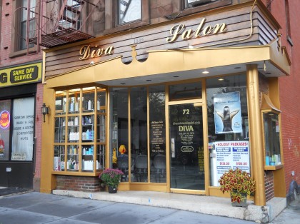
Diva Salon at 72 Henry Street has a new look. Ladders and paintbrushes surrounded the entrance over the last few days, as the salon recieved a new facade complete with a fresh coat of gold paint. What do you think of the new style?
Diva Salon Gets a Makeover
Connect with BHB
- AEB
- harumph
- pankymom
- nabeguy
- cat
- Curmudgeon
- Po
- Lo
- nabeguy
- Andrew Porter
Nabe Chatter
- Arch Stanton on Open Thread Wednesday
- Arch Stanton on Carjacking on Joralemon?
- clarknt67 on Open Thread Wednesday
- Peter Scott-Thomas on Open Thread Wednesday
- Bornhere on Carjacking on Joralemon?
- Andrew Porter on Open Thread Wednesday
- Nosey Neighbor on Open Thread Wednesday
- Andrew Porter on Open Thread Wednesday
- MaggieO on Open Thread Wednesday
- Nosey Neighbor on Open Thread Wednesday
Latest Stories
Support BHB
Buy essential books about Brooklyn Heights here.
Buy all your favorite AMAZON products via the BHB Store. Click here to get started.
Buy all your favorite AMAZON products via the BHB Store. Click here to get started.
- Open Thread Wednesday November 20, 2024
- Carjacking on Joralemon? November 21, 2024
- Subway Service Alerts: Brooklyn Heights and Nearby November 21, 2024
- Subway Service Alerts: Brooklyn Heights and Nearby November 21, 2024
- Carjacking on Joralemon? November 21, 2024
- Open Thread Wednesday November 20, 2024
News Tips
If you have a Brooklyn Heights news tip let us know. Click here to send us an e-mail.


