Two Years Ago on BHB: The Aesthetic Crimes of Henry Street

BHB November 11, 2006:

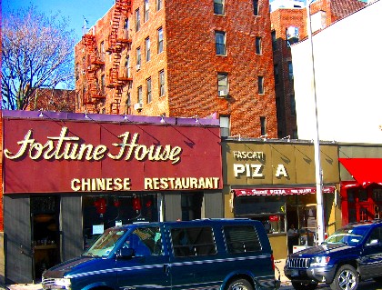
The condition of these signs on Henry Street would be deplorable anywhere, much less in a Landmark District. If this section of Henry Street is ever going to rebound (as it seems it might), aesthetic crimes such as these must be remedied.

The Fascati sign was fixed shortly after this piece ran.  To the best of our knowledge, the Fortune House sign remains the same.

Share this Story:

, , ,

  • E G

    Who’s aesthetic?

  • AEB

    The Fortune House sign is emblematic of the restaurant itself: time in a bottle, that time being the early 80s, I’d say.

    I’ve gone through many. many changes concerning FH, which I find myself in with astounding frequency.

    Like her restaurant, with its frozen decor–the worn carpets, the tinsel over the counter, the old aquarium with its bobbling fish–the owner has achieved a quality of laconic indifference to time’s sway.

    Initially, I found this frustrating, even annoying. But I’ve passed through early opprobrium and now find myself kind of…liking the fact that, in a world out-of-control, there’s one constant: Fortune House.

    Though perhaps the “F” on the sign should be repaired, for the general good.

  • ABC

    Aesthetic crimes??

    I LOVE the Fortune House sign as is. I hope they never touch it.

    I liked the Fascati sign too, it in it’s PIZ A days.

    There’s design and then there’s found design. I would wager that the Fortune House exterior has had more photos taken of it than any other restaurant in Brooklyn Heights.

    I never liked the inside of Fortune House — and all that goes with it — until I had kids. There is something about waiting for mediocre chinese while the toddlers stand with their noses pressed against a dirty fish tank that makes me feel 100% okay with the world.

  • anon

    Have to disagree, Homer. Leave the Fortune House sign alone. We do not want Henry Street to lose it’s charm and start looking like the strip mall Montague St became. This neighborhood has devolved into conformism which bases everything on how something/one looks, how much they paid for something and not for it’s character. The FH sign shows character. I remember seeing Norman Mailer who is on another post in front of the Fortune House walking around the Heights with a torn down jacket held together with grey duct tape. He had real talent but those who look at the shallow end of the pond would never get it.

  • Luke C

    I agree, they do rob the block of the genteel style of the side streets, but compared to the towering, crumbling concrete monstrosities across the street, the real crimes of the Busy Chef manager and the annual renovation of those same spaces when they fail to produce a viable restaurant, the Fortune House and Fascati signage are trivial.

  • TK Small

    I am very much encouraged by these remarks! Personally I do not want to live in a “Stepford neighborhood”.

  • GHB

    I always thought it was “Torture House”!

  • AliG

    What a moronic comment. Pls focus on real “crime” in the hood. Henry’s End doesn’t look like anything special on the outside and it’s a real gem.
    Let’s focus on the derelicts mugging our residents in broad daylight..

  • stan

    Ali very constructive comment… not!

  • AliG

    stan, so was yours.

  • lakisha

    the signs are completely out of line with our charming neighborhood!!!!there is nothing wrong with passing along comments that make sense!!!!!

  • my2cents

    The biggest aesthetic crime on henry is on the opposite side of the street! Those high rises irreperably destroyed whatever hope for vibrant street life there ever was. and the worst part is they are there for good….

  • David on Middagh

    I moved to the neighborhood in 1991. For years, I did not enter Fortune House. I assumed the exterior bode ill for all that was inside. If only I had known how wrong I was!

  • jim

    leave the signs alone !!

  • my2cents

    Fortune house is definitely better than Great Wall. Also you can tell them to make it spicy, and the food tastes a lot better! I love their sign, and I love the fascati sign too. Why pick on them? They are some of the few inexpensive places to eat in the area that are open reasonably late. God Bless em!

  • Jazz

    Have any of you geniuses noticed that Homer was reposting something from TWO YEARS AGO?

  • ABC

    I think we all noticed he was bringing up something he brought up 2 years ago.

  • Peter

    my2cents, haven’t those towers been around for like 40 years or so? Seems a bit long to hold a grudge, its not like they were just built.

  • DT

    And they were built as middle-income housing to allow people who otherwise couldn’t afford this neighborhood to live here (which is a good thing, despite their having gone private a few years ago…). Also, those towers house a lot of people, without whom some of the retail/restaurant businesses in our neighborhood couldn’t survive. Yes, they’re ugly, but beautiful buildings don’t get built for middle income…

  • my2cents

    My main complaint is about the site plan more than the incredible mediocrity of the architecture, which is par for the course in 60s/70s NY high rises. I have no gripe that they were built for middle income people, but remember too that they were built during a period when Brooklyn Heights was not an exclusive neighborhood like today, and it was designed, as many apt. complexes of its era to keep the street life *out* (hence all the inaccessible catwalks,terraces, etc) rather than embrace it – essentially Pre-Jane Jacobs planning thinking. Now we’re still stuck with it. Instead of putting a lot of stores on the street frontage, there is just gristedes and P&P. As a result there is no life on one side of the street, Pineapple walk is often like a ghost town. So if people want to talk about graphic design on a sign ruining the character of a block, let’s focus on bad architecture and planning ruining the character and the business ecosystem on the block. People talk about the cursed businesses on Henry all the time and wonder what Smith street has that works. Well, business frontages on both sides of the street is CRUCIAL for foot and car traffic. And unlike a crappy sign, this complex is here forever. I would call it an aesthetic HIGH Crime, and sadly it is so taken for granted that people don’t even seem to notice how truly heinous it really is. But as a design professional, I think about it all too often.

  • Andrew Porter

    If you cast your views back to the mid-1960s, you’ll remember that initially Robert Moses planned to make the highrises one long building, going from Clark Street all the way to past Middagh Street, to consist solely of studio apartments. The BHA plus others resisted the plan, putting in place what’s there now. The row of single story stores are actually a permanent “place holder”, a retail row which could be replaced by 50′ high buildings. Be glad we have a bunch of inexpensive eateries there. BTW, where the cleaners is now was once a Good Humor ice cream store; the car service was the first home of Beastly Bite, now on Court Street in Cobble Hill; and Fortune House’s sign was in bright red plastic, inexplicably painted its current faded color a couple of decades ago.

  • Sally

    I love the Fortune House sign.