27 Cranberry Preliminary Design Released – Now with Clear Photos

Earlier today, Brownstoner “leaked” the designs that architects created for developer Louis Greco, who purchased the vacant lot at 27 Cranberry Street.

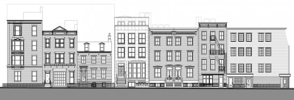
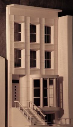
BHB has obtained clear copies of the renderings of the preliminary design submitted to the Landmarks Preservation Commission from architect Tom van den Bout. This design is in accordance with what he told BHB last month; that the building would be a “new brownstone” rather than, as Brownstoner puts it, “a mini-On Prospect Park.” (Drawing of how the new building will fit into the block just added, after the jump.)

This drawing shows the new building towering over 25 Cranberry, the small wooden house to its left, and slightly higher than 29 Cranberry to its right. The model does not show a fifth story, visible in the drawing, the front of which is recessed behind the cornice and evidently will not be visible from the street.
Share this Story:

, , , , ,

  • Cranberry Beret

    I find it difficult to believe that the fifth story won’t be visible from the street. All you would have to do is stand in front of 23 or 25 cranberry and look up – since 25 cranberry is short, you’d be able to see right over it and see this “recessed” floor from its front left.

  • karl Junkersfeld

    Cranberry Beret,

    It can be done. Look at the attached video of Love Lane Mews Condo and you can see it being done successfully.

    I was there yesterday and couldn’t see the penthouse from the street. By the way, these condos are beautiful but well beyond my financial resources.

    http://www.ny1.com/content/133750/brooklyn-condo-complex-shows-history-some-love

  • Andrew Porter

    It’s a good design, a lot less horrific than our fevered imaginations had made it out to be.

  • resident

    Anyone know the actual language used to describe the requirement that rooftop additions “can’t be seen from the street”? It would seem that a hard and fast rule that an additional floor can’t be seen from any angle would be impossible here. With 27 cranberry being so much smaller, it would seem that the fifth floor will be visible from specific angles. Additionally, Karl brings up Love Lane Mews as an example of hiding the addition, but across the street, the same developer looks to be adding a floor to a carriage house, that you can just barely see at the right angle.

    Karl, you toured Love Lane Mews? While buying there is also well beyond my financial resources, I have a question concerning some of the bedrooms. Walking by and peeking in the windows, some of the bedrooms seemed very small, did you get that feeling too?

  • carol

    All in all, I think this is very handsome. It evokes the Appelate Court Building on Monroe Place – a successful building within the historic district that isn’t a copy cat.
    With respect to the the 5th floor, I find it amusing that many of our historic row houses have an added floor – often disguised by a mansard roof.

  • AEB

    Hope it’s done in white stucco. Grade: brutto.

  • http://Building Jeffrey J Smith

    Well, this looks like white primer so what will be the final color?
    That semi humor aside…thisis a typical post modern binality…
    there are hundreds of fine classical forms which could be applied
    but no, this HAS to be a yuppie era binal design….look at the door
    it looks to me like its simply derived from a budget lumber yard
    door of the l960’s…ugh

    ye gods..withall the talent and MONEY in the Heights THIS is the
    LEVEL of design which is acceptable?

    What would be the acceptable design if this was built in the 1950’s
    or 1960’s for, say what you want about them, some old casino family’s child?

    This is a great example of change the human material, change
    the city…..at least to my lights.

  • nabeguy

    Nothing says Cranberry Street like an Appellate Court Building knock-off. As my wife pointed out, this looks more appropriate to the Upper East Side. It definitely could have been worse, but I wonder about the “pissing-contest” aspect of its height…yes, it follows a line, but of a building that is not adjacent, and certainly not to its neighbor to the west, which is left to languish in the shadow of the Scarano school of architecture.

  • stuart little

    the lower part does not seem to go with the upper part. but that’s just me.
    the cornice seems a little crude and are the piers curved inward? Not crazy about that either. Needs work but it is a good start.

  • Demonter

    Belgravia in Brooklyn Heights…you blend.

  • http://selfabsorbedboomer.blogspot.com Claude Scales

    AEB: In the words of Mr. van den Bout, it will be “actual brownstone – heavy, dimensionally cut stone – not stucco or veneer.”

  • AEB

    Thanks, Claude.

    My thought was, it has–at least in the model–a massive mismatched quality that, to me, awkwardly alludes to and blends row-house design with “grand” public-building references. Generic on both counts. And deserves to be white stucco.

  • my2cents

    Pretty inoffensive, I think. I was hoping for something
    edgier that would piss people off :-) I think when executed in
    actual brownstone material, the house will have a very refined,
    elegant look,especially the way that undulating facade will take
    the light that spills down cranberry from the river as the sun goes
    down.

  • http://Building Jeffrey J Smith

    Well. again, maybe its still in white primer..lets see we could use some candy apple red, pearl or…it really needs some metalflake flames…Overhauling my, well, whitestone…?

    Seriously, perhaps i’m totally wrong, but THIS is the level of
    design quality…in the HEIGHTS?

  • http://Building Jeffrey J Smith

    all in all I’d prefer the rendering be done by a Nicholas Michael…

  • lori

    It reminds me of 222 Columbia Hts, the “Tootsie Roll” House.

  • Jorale-man

    It’s not bad considering how it could have gone. It’s interesting how they opted for a real brownstone-style stoop, not a street level entrance.

  • Eddy de Lectron

    Humm I wonder how that design meets the ADA requirements?

  • http://www.cognation.net dean collins

    I think it looks great. I dont know what people are complaining about. If you think we should all live in 2 story wood houses like next door then how do you justify moving out of single level “settlers” lean to or even worse cave dwelling.

    Architecture is fluid and changes over time.

    This is a great design and they do “own” the land….they should be allowed to move forward with this design.

  • http://Building Jeffrey J Smith

    No one anywhere above said anything about 2 story wood houses and no one wants any hobson’s choices thank you
    but you are correct-architecture IS fluid-the problem is in
    this age the fluid is flowing DOWNHILL

  • Andrew Porter

    ADA requirements are for multi-family buildings, which this isn’t.

  • EHinBH

    Looks awsome. Hopefully they wont use that door style.

  • nabeguy

    EH, what exactly do you appreciate about the rest of the architectural style of the Heights that would make you call this “awesome”? I will agree with you that the door style is completely out of context, but, hey, the modernists had to have some say, no?

  • EHinBH

    The Heights is beautiful because there is a large mix of styles. We have bulky red-brick buildings, giant 1960s towers, townhouses, carraige houses, federal style homes, greek, gothic… The list goes on. What is wrong with a brand new, single-family home on an amazing street? It’s awsome. I would take it in a second.

  • nabeguy

    Simple answer EH. The Heights doesn’t need a deviation from what it already has, which this proposal represents. Awesome as it may be.

  • Demonter

    Very institutional looking…I don’t like it.

  • Lori

    what happened to the previous building?

  • whosehouse

    I hope the person that is making this house, never sees this blog. It’s rude that it was even placed on here for commenting. I wouldn’t want you guys as neighbors…get a hold of yourselves. look at the rendering and move on.

  • David on Middagh

    Whosehouse, the new structure is being added to a Historic District. It’s design particulars are very much community news, and I find the comments interesting, if frank.

  • David on Middagh

    P.S. I reserve the right to add an apostrophe to possessive “its” after midnight on a Tuesday.